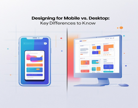
In the evolving digital landscape, designing websites and applications that function seamlessly across devices is no longer a luxury—it’s a necessity. With mobile usage surpassing desktop in terms of web traffic, designers must understand the unique demands of both platforms. While the end goal is the same—providing an excellent user experience—the path to achieving it differs significantly between mobile and desktop.
Understanding the core differences between designing for mobile and desktop devices is crucial for creating responsive, intuitive, and accessible digital experiences. Here’s a breakdown of the key differences every designer should know.
1. Screen Size and Real Estate
The most obvious difference between mobile and desktop design is screen size. Mobile devices offer limited screen space, which means content must be prioritized and simplified. Designers must focus on essential features and provide a clean, uncluttered interface. On desktops, larger screens allow for more detailed layouts, multiple columns, and expanded navigation.
In mobile design, less is more. Every pixel counts. Interfaces should minimize the need for excessive scrolling or zooming. On desktop, however, designers can include more detailed elements and display multiple layers of content at once.
2. Navigation and Interaction
Navigation varies greatly between mobile and desktop. Mobile users rely on taps, swipes, and gestures. Therefore, mobile design should feature larger touch targets and intuitive gestures. Drop-down menus, hamburger icons, and swipeable carousels are common in mobile interfaces.
In contrast, desktop users interact through clicks and hover states, allowing for more intricate navigation structures like mega menus, hover tooltips, and sidebar navigation. Desktop navigation can be more comprehensive and layered, while mobile navigation must be concise and intuitive.
3. Performance and Load Times
Mobile users often access websites on slower networks or less powerful devices. As a result, mobile design must prioritize performance. Images should be optimized, code should be streamlined, and third-party scripts should be minimized. Speed is crucial—users are likely to abandon slow-loading mobile pages.
On desktops, while performance still matters, the higher processing power and more stable internet connections allow for slightly heavier designs, including high-resolution images and more complex animations.
4. Content Prioritization
Because of the smaller screen, mobile design forces content prioritization. Designers must identify what information users need first and present it clearly. The mobile-first approach emphasizes starting with mobile and progressively enhancing the experience for larger screens.
On desktop, there’s more room to include secondary information, sidebars, and additional visuals without overwhelming the user. Designers can offer more in-depth experiences with multiple layers of content.
5. User Context and Behavior
Mobile users are often on the go. They may be looking for quick answers, directions, or immediate interaction. Mobile design should therefore focus on speed, convenience, and immediacy. Call-to-action buttons should be prominent, and forms should be short and easy to complete.
Desktop users are typically in a more stationary environment and may engage in longer sessions. They are more likely to read detailed content, compare products, or perform research. Desktop design can support more exploratory behavior and provide greater depth of information.
6. Typography and Readability
Font size and spacing are critical on mobile. Text must be large enough to read comfortably on small screens without zooming. Designers should ensure ample line spacing and avoid dense blocks of text.
On desktop, there is more flexibility with typography. Larger screens allow for multiple font styles and sizes within the same layout. However, maintaining readability remains key regardless of the platform.
7. Input Methods
Mobile users input via touchscreens, so buttons must be finger-friendly, with enough spacing to avoid accidental taps. Forms should be minimized and use native input fields for easier data entry.
Desktop users have access to a keyboard and mouse, allowing for more precise control and easier input of longer text. Desktop forms can include more fields, but usability should still be a top priority.
Conclusion
Designing for mobile and desktop requires different strategies, but the objective remains the same: deliver a user-friendly, efficient, and engaging experience. Understanding the unique constraints and opportunities of each platform allows designers to craft responsive, adaptable designs that serve users wherever they are.
By embracing the differences—whether it’s screen size, navigation, or performance—you can create digital experiences that not only look great but function flawlessly on both mobile and desktop devices. In today’s multi-device world, mastering this balance is the hallmark of effective web design.
Great experience with Computer Geek. They helped with my website needs and were professional, respon . . . [MORE].
Great, quick service when my laptop went into meltdown and also needed Windows 11 installed. Also ca . . . [MORE].
It was a great experience to working with you. thank you so much. . . . [MORE].
Thank you so much for great service and over all experience is good . highly recommended for all peo . . . [MORE].
We engaged The Computer Geeks in mid-2023 as they have a reputation for API integration within the T . . . [MORE].

What Happens When the Clo

How Data Centers Power th

Edge Computing Explained
