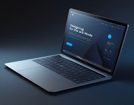
Dark mode has rapidly transitioned from a trend to a standard feature in digital design. With major operating systems and apps offering dark mode options, users now expect the same flexibility on websites. Dark mode isn't just about aesthetics—it reduces eye strain, conserves battery life on OLED screens, and enhances focus by minimizing bright screen glare. But implementing dark mode effectively requires more than inverting colors. Here’s how to design for dark mode using best practices for modern websites.
1. Understand the Purpose of Dark Mode
Dark mode reverses the traditional light-on-dark scheme to a dark-on-light one, reducing luminance emitted by screens. It’s particularly useful in low-light environments and helps mitigate visual fatigue. While some users prefer it purely for visual appeal, others benefit from its functional advantages. Therefore, your implementation should support both performance and accessibility.
2. Use True Colors Thoughtfully
Dark mode doesn't mean simply switching white backgrounds to black. A completely black background can feel harsh, while pure white text creates high contrast that may strain the eyes. Instead, use dark gray (#121212 or #1E1E1E) backgrounds and soft off-white (#E0E0E0) or light gray text. This maintains readability while providing a comfortable viewing experience.
3. Maintain Brand Identity
Colors behave differently on dark backgrounds. Your branding, such as logos or primary color palettes, may not translate well from light mode to dark mode. Adapt brand colors with slightly altered tones or add outlines to logos to retain visibility and identity without compromising design integrity.
4. Optimize Images and Media
Images with transparent backgrounds or light edges can look awkward or disappear in dark mode. Use alternate versions of images if necessary, or apply subtle borders or drop shadows to ensure visibility. Also, consider using CSS filters or SVGs that can dynamically change based on the theme.
5. Test Typography and Readability
Text needs to be legible in both light and dark themes. Ensure adequate contrast ratios for body text, headings, links, and buttons. WCAG (Web Content Accessibility Guidelines) recommends a minimum contrast ratio of 4.5:1 for normal text. Use tools like WebAIM’s contrast checker to ensure compliance.
6. Use System Preferences for Seamless Switching
Modern browsers support CSS media queries like prefers-color-scheme, which allows your website to detect a user’s system theme and adjust accordingly. This enhances user experience by providing a seamless transition without needing manual input.
7. Provide a Manual Toggle
Even if you implement automatic detection, it’s best to let users toggle between light and dark modes manually. This enhances control and ensures users who have specific visual preferences aren’t forced into one mode. Store their preferences using localStorage or cookies so their choice persists across visits.
8. Consider Component Design
UI elements such as modals, dropdowns, and tooltips should be tested and styled for both modes. Shadows, borders, and background layers behave differently in dark mode and can affect user perception if not adjusted properly.
9. Test Across Devices and Browsers
Make sure your dark mode design functions consistently across different devices, screen resolutions, and browsers. Differences in rendering between platforms can affect appearance and functionality, so thorough QA testing is essential.
Conclusion
Dark mode isn’t just a design trend—it’s now an expectation. A well-implemented dark mode shows attention to detail, enhances usability, and improves accessibility. By following these best practices, you can ensure your website feels modern, inclusive, and user-friendly no matter how it’s viewed. As user preferences continue to evolve, flexible and thoughtful design will remain key to digital success.
Great experience with Computer Geek. They helped with my website needs and were professional, respon . . . [MORE].
Great, quick service when my laptop went into meltdown and also needed Windows 11 installed. Also ca . . . [MORE].
It was a great experience to working with you. thank you so much. . . . [MORE].
Thank you so much for great service and over all experience is good . highly recommended for all peo . . . [MORE].
We engaged The Computer Geeks in mid-2023 as they have a reputation for API integration within the T . . . [MORE].

Can AI Really Be Creative

AI in Education: How Clas

What Technology Might Loo
