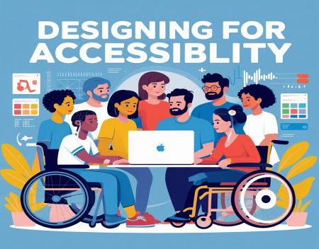
In today’s digital world, accessibility is not just a legal requirement—it’s a moral obligation and a smart business practice. Designing for accessibility ensures that people of all abilities can use, interact with, and benefit from your website. From users with visual impairments to those with mobility or cognitive challenges, accessibility opens the door to a wider audience and delivers a better user experience for everyone. Inclusive web design is about creating a web environment that is usable, respectful, and navigable regardless of physical or cognitive ability.
Here are some best practices to follow when designing for accessibility.
1. Use Semantic HTMLOne of the foundational principles of accessible design is using semantic HTML. Proper use of tags like <header>, <nav>, <main>, <section>, and <footer> helps screen readers and assistive technologies understand the structure of a page. Similarly, using <h1> through <h6> tags to create a logical heading hierarchy allows users to quickly navigate content.
Avoid using generic containers like <div> and <span> for structural purposes unless absolutely necessary. Always provide meaningful labels and ensure each element is used according to its intended function.
2. Provide Text Alternatives for Non-Text ContentImages, videos, and other non-text content must include descriptive text alternatives so that users relying on screen readers can understand their purpose. Use the alt attribute on images to describe what the image represents. For complex graphics like charts or infographics, provide a detailed caption or separate data table.
For video content, include captions and transcripts. For audio-only content, offer a text version. These alternatives not only assist those with hearing or vision impairments but also improve SEO.
3. Ensure Sufficient Color ContrastMany users have visual impairments, including color blindness or low vision. Ensure that there’s enough contrast between text and background colors. As a rule of thumb, body text should have a contrast ratio of at least 4.5:1 against its background, and larger text (18pt or 14pt bold) should have a ratio of 3:1.
Avoid using color alone to convey meaning. For example, instead of highlighting errors in red only, use icons or text to indicate the issue clearly.
4. Make All Interactive Elements Keyboard-AccessibleNot every user navigates a website with a mouse. Users with motor disabilities or visual impairments often rely on keyboard navigation. Make sure all interactive elements—like links, buttons, forms, and menus—can be accessed and used via the keyboard alone.
The focus indicator (often a visible outline around the element in focus) should be clearly visible to show users where they are on the page. Avoid removing this visual cue unless you replace it with a more accessible solution.
5. Design Clear and Consistent NavigationConsistent navigation helps all users understand how to move through your site, but it’s especially important for those with cognitive disabilities or screen reader users. Use clear labels, group related items together, and ensure the same navigation structure is present across your pages.
Provide a “skip to content” link at the top of the page so keyboard and screen reader users can bypass repetitive navigation and go straight to the main content.
6. Label Forms Clearly and Use Error Messaging WiselyForm fields must have clear, descriptive labels. Never rely on placeholder text alone, as it disappears once the user starts typing. Labels should be explicitly associated with their input fields, using the label tag for accessibility.
Additionally, error messages should be specific and easy to understand. Indicate errors clearly and provide suggestions to fix them. Always make sure error notifications are accessible to screen readers.
7. Test with Assistive TechnologiesNo accessibility checklist is complete without user testing. Use screen readers like NVDA, VoiceOver, or JAWS to test your site’s usability from a non-visual perspective. Check for logical reading order, keyboard navigability, and accurate alternative text.
Additionally, involve people with disabilities in usability testing. Real-world feedback is invaluable in identifying barriers and improving inclusivity.
8. Follow WCAG GuidelinesThe Web Content Accessibility Guidelines (WCAG) provide a comprehensive framework for accessible design. Currently, WCAG 2.1 is the most widely adopted standard, and meeting Level AA compliance is the baseline most organizations strive for. These guidelines focus on four main principles: content must be Perceivable, Operable, Understandable, and Robust (POUR).
Regular audits and accessibility checks using tools like Axe, WAVE, or Lighthouse can help ensure compliance and highlight areas for improvement.
Final ThoughtsDesigning for accessibility isn’t just about compliance—it’s about respect, equality, and creating an inclusive online space. By following accessibility best practices, you make your website usable for everyone, regardless of ability. In turn, this improves your brand’s reach, user satisfaction, and even search visibility.
Inclusive design is good design. The more we build with everyone in mind, the better the web becomes for all of us.
Great experience with Computer Geek. They helped with my website needs and were professional, respon . . . [MORE].
Great, quick service when my laptop went into meltdown and also needed Windows 11 installed. Also ca . . . [MORE].
It was a great experience to working with you. thank you so much. . . . [MORE].
Thank you so much for great service and over all experience is good . highly recommended for all peo . . . [MORE].
We engaged The Computer Geeks in mid-2023 as they have a reputation for API integration within the T . . . [MORE].

What Happens When the Clo

How Data Centers Power th

Edge Computing Explained